Highlighted Work: Project Case Studies
Choose a Case Study Type:
Mobile App UI + Web UI Design: Weight Wager App
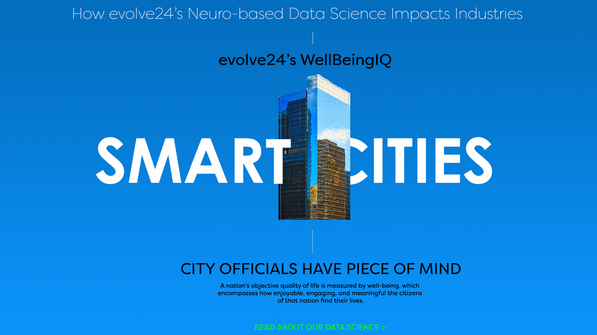
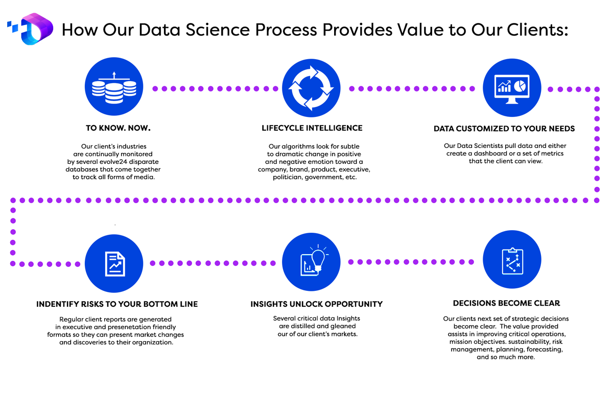
Low Fidelity Web Wireframes plus Final UI: evolve24
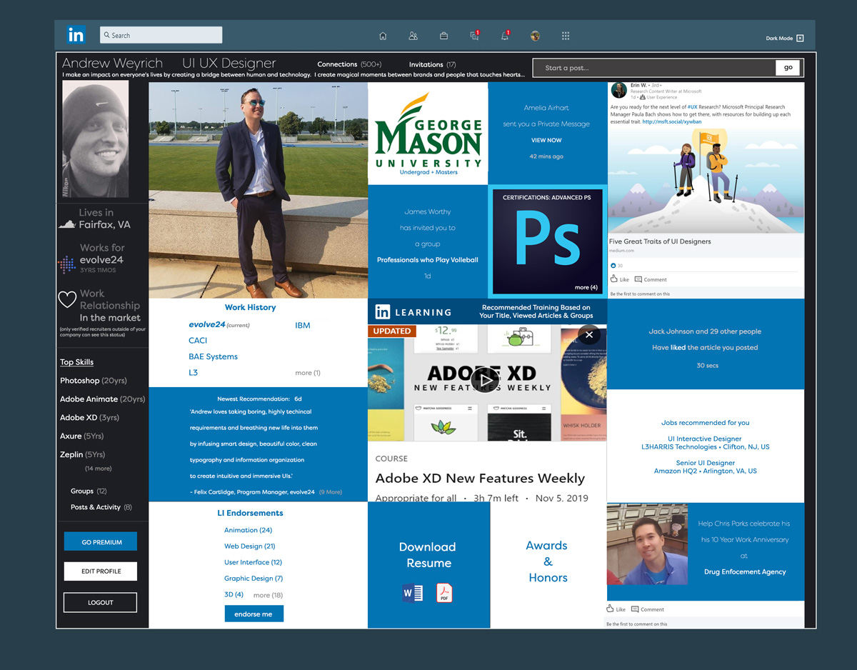
Design Challenge: LinkedIN Re-imagined (Design Challenge in just 1 hour)
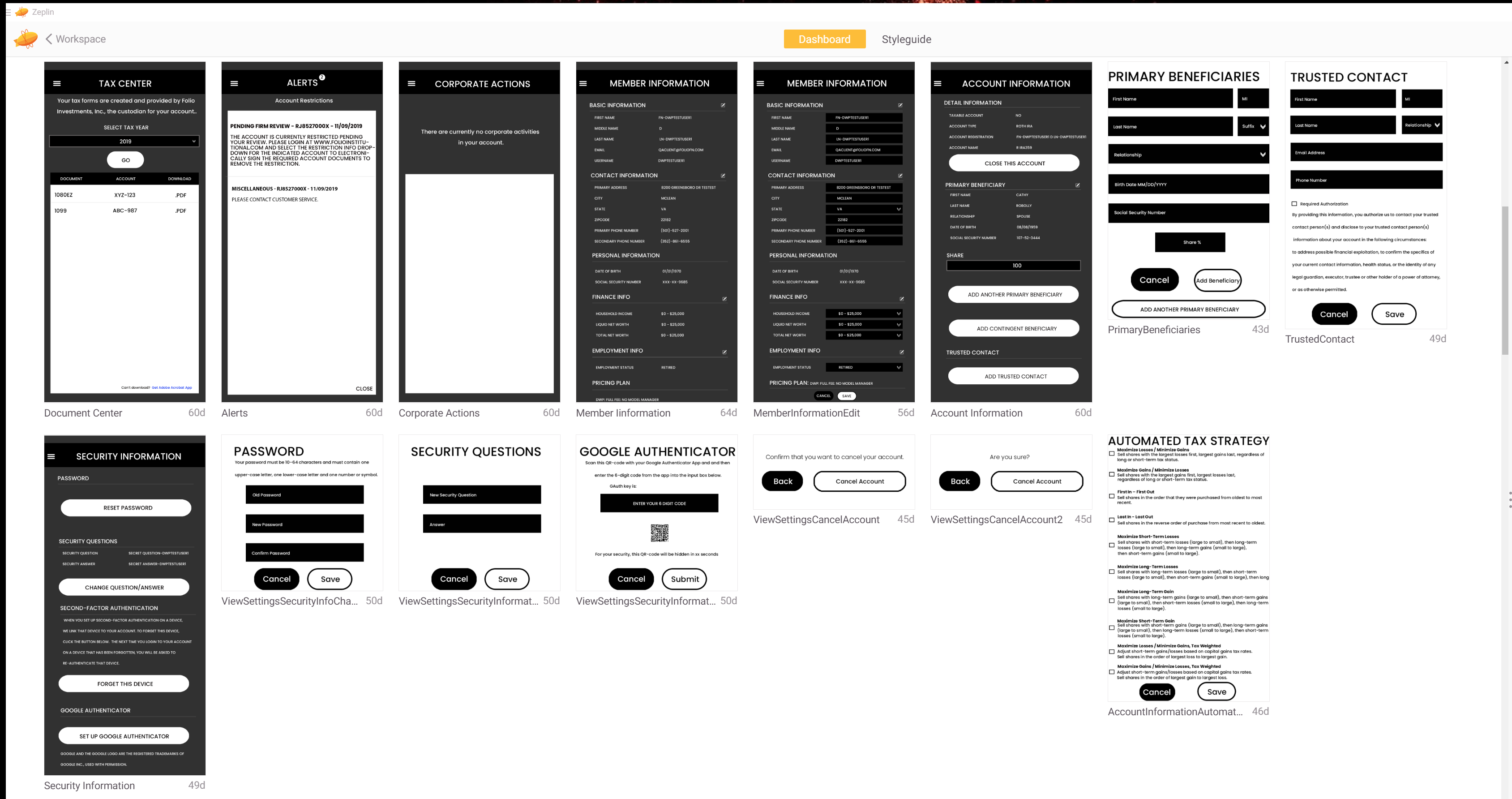
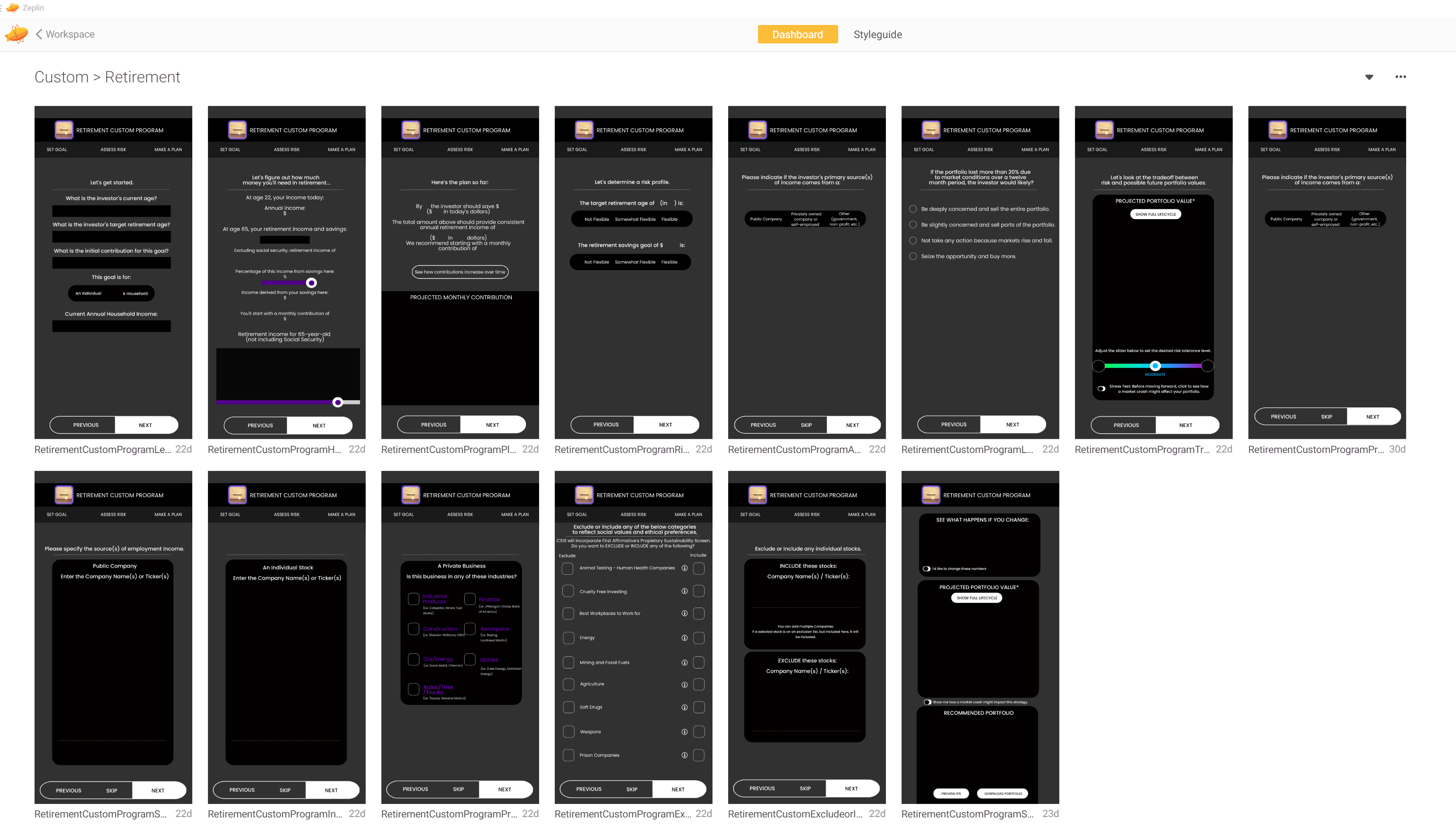
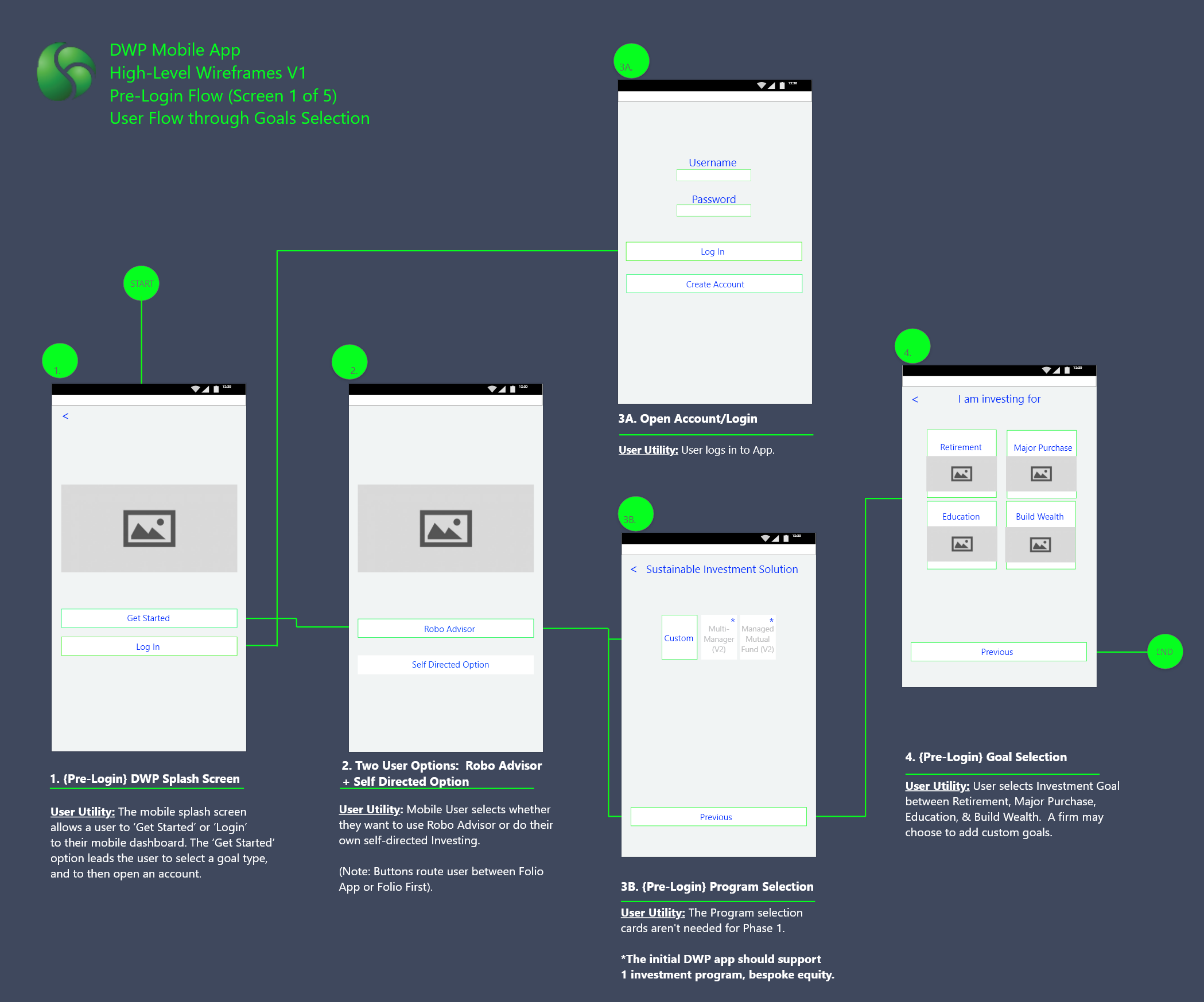
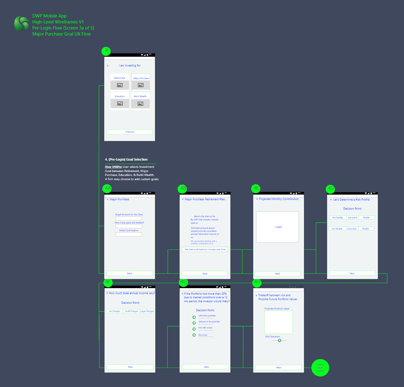
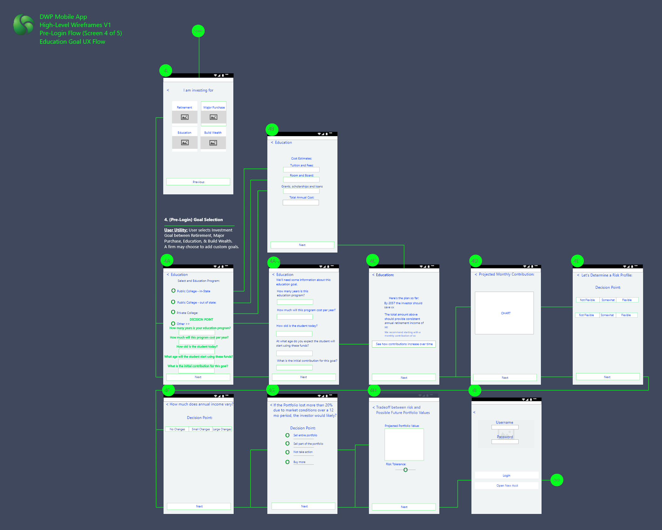
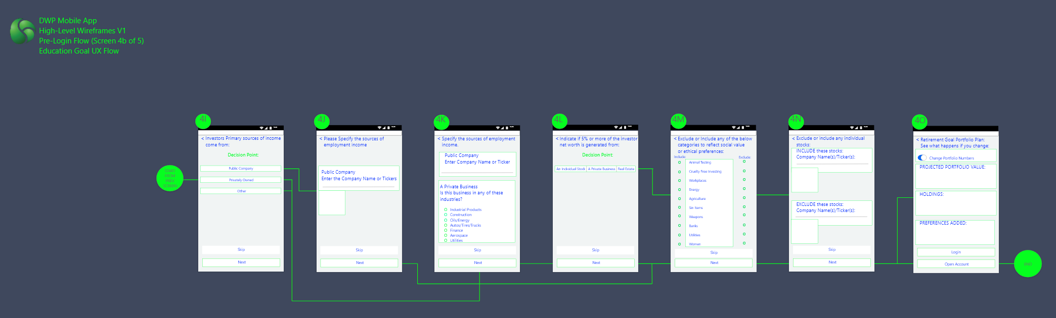
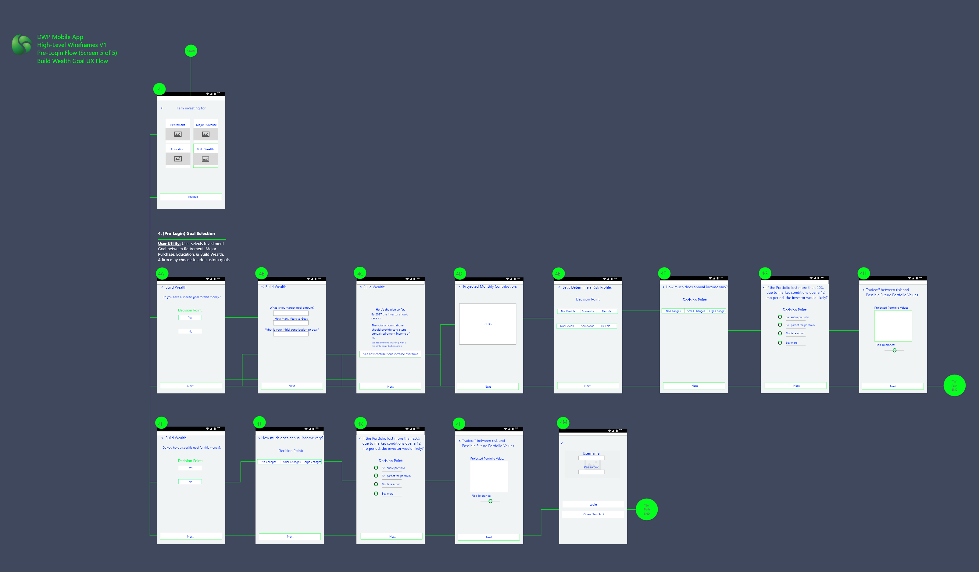
Low Fidelity Mobile Wireframes to Early Mobile UI: Folio Financial
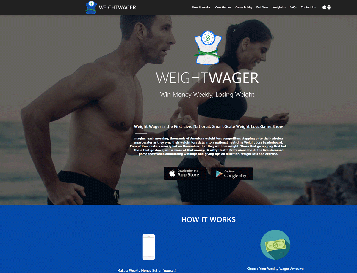
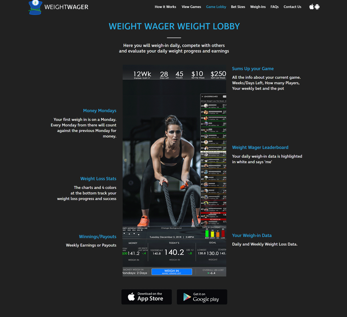
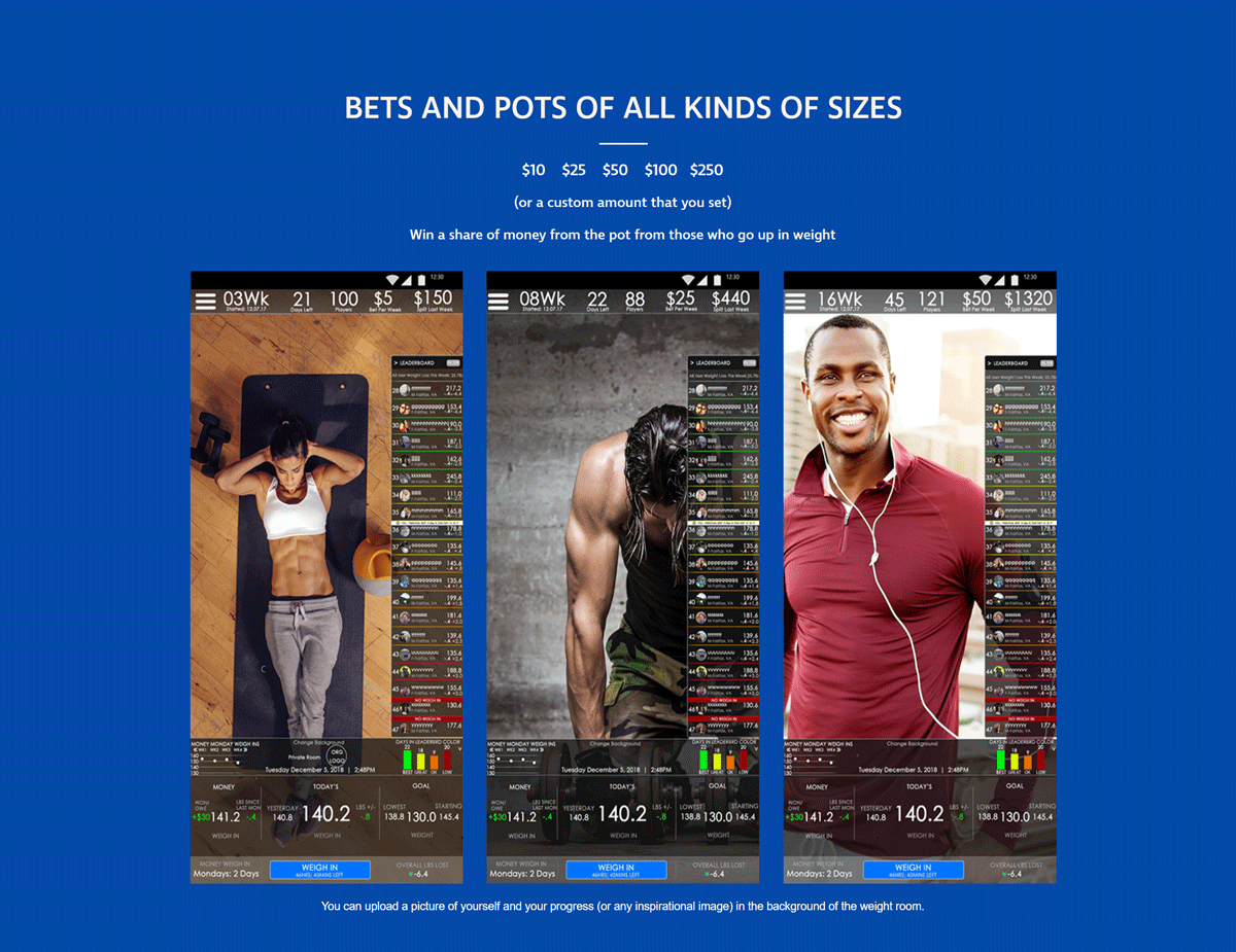
Client: Weight Wager
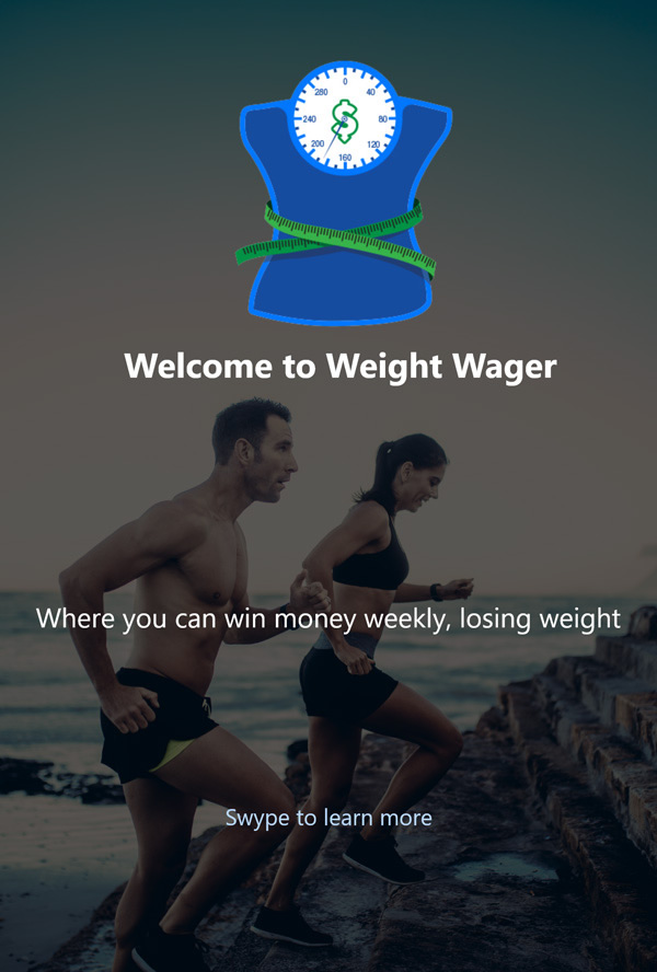
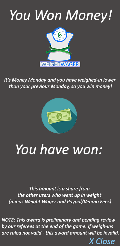
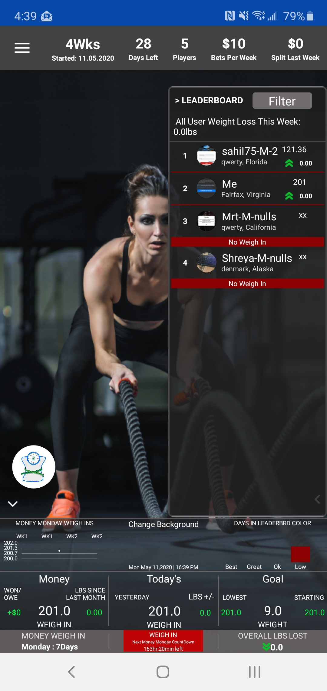
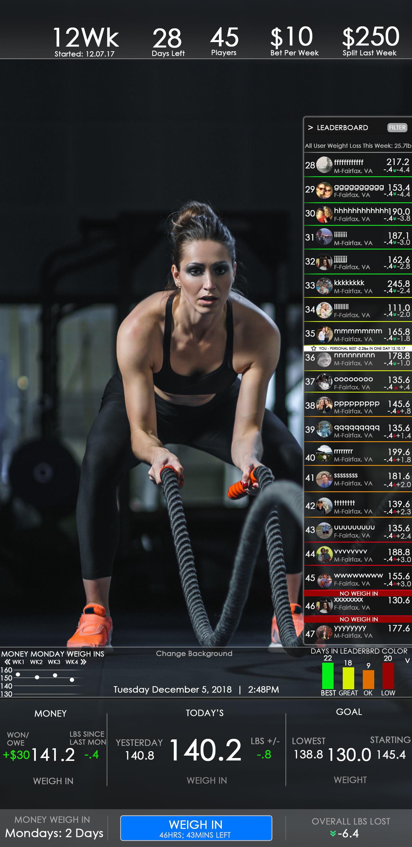
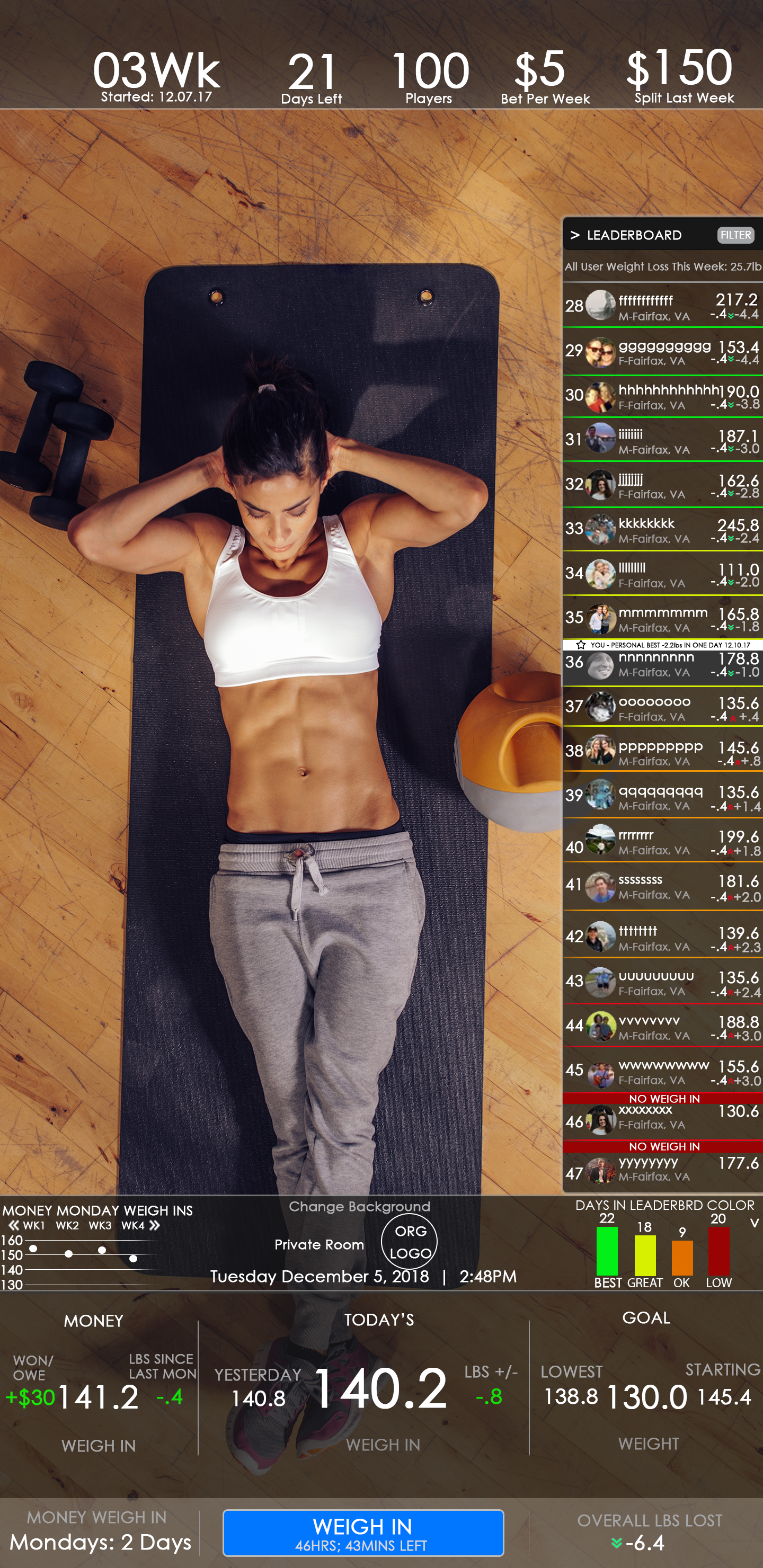
App Concept: Weight Wager is the First Live, National, Weekly, Weight Loss Scale Competition. Imagine, each morning, thousands of American weight loss competitors stepping onto their wireless smart-scales as they sync their weight loss data into a national, real-time Weight Loss Leaderboard. Competitors make a weekly bet on themselves that they will lose weight. Those that go up, pay that bet. Those that go down, win a share of that money. A witty Health Professional hosts the live-streamed game show while announcing winnings and giving tips on nutrition, weight loss and exercise.
The app provides plenty of features to keep the user engaged, such as weekly weigh-ins, a daily growing money pot (new users onboard into your game all the time so it's exciting to check on the money), on Monday's checking to see if you went down in weight and won money (or lost it).
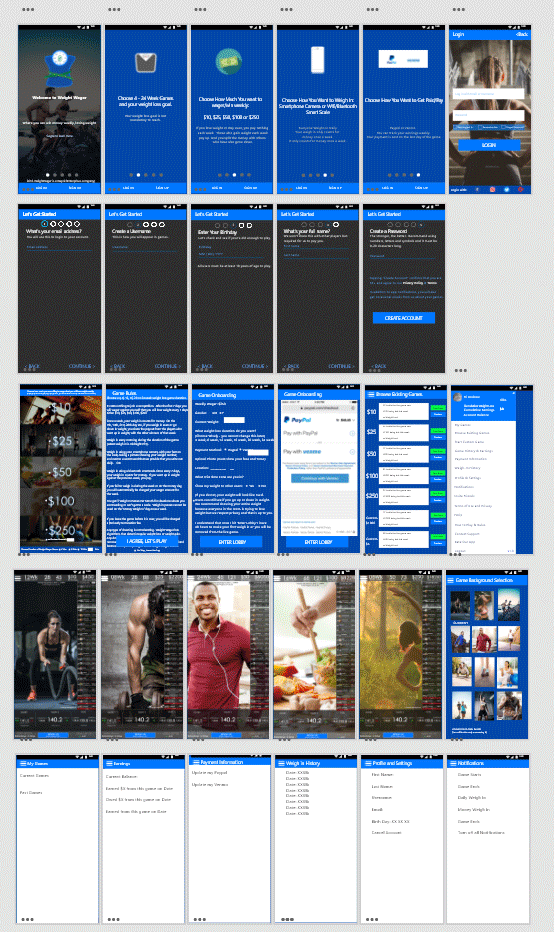
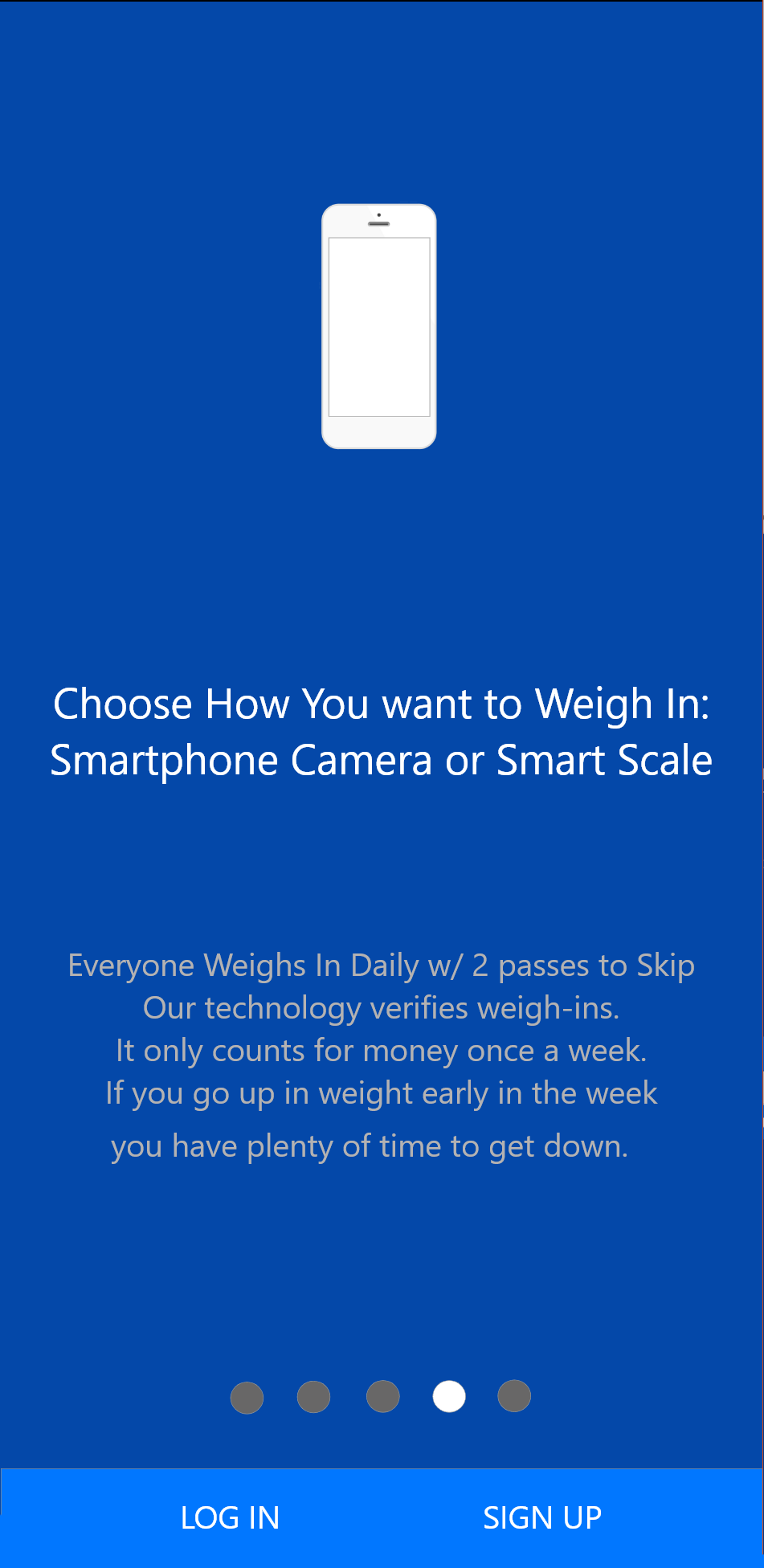
As well as, an overall dark theme to match current design trends. When the app was done, I designed a fully responsive, HTML 5 marketing webstie for the app itself. I worked hard to decrease the number of signup and onboarding screens and made sure that the user only accomplishes one obvious feature/utility per screen, so that the initial user experience is more smooth. 1st Row Marketing Screens, 2nd Row Signup Screens, 3rd Row User onboarding screens, 4th Row User Game Screens, 5th Row Hamburger Menu.
User Research
I initally asked 10 beta testers to answer pre-qualification questions to gather their personas, ranging from how much weight do they want to lose, to if they owned a smartphone and scale to what are their motivations for weight loss. The onboarding pre-qualification beta user form is here:
https://weightwagerform.carrd.co/
Then app was tested with the remote testing tool Helio.app where I asked over 25 user research and post-usage app experience questions to determine pain points and UX Defects within the app.
Here are some responses from that test:
https://my.helio.app/report/01EAAD0XDZ59F605TH78RDRB8V
These users had used the app for 3 weeks. Users ranged from men to women who were excited to lose anywhere from 5lb - 110lbs. All of them gained weight recently. All of them own scales or smart scales in their home. All of them own smartphones. All of them have enough disposable income where they could bet (and lose) anywhere from $10 - $100 per week on the weight loss competition. The interviews conducted helped look at the usability and intuitiveness of features and the content. I also got emails from users asking some questions during the onboarding into the app and game and these surveys really helped me understand their behaviors and pain points.

Pain Points
Based on the user research, the most important problems were:
- Sometime it was not clear to them which game to choose - there are a lot of different game options.
- Users had questions when it came to their first video weigh-in, in the app onboarding process.
- Users were not always reading all of the rules of the game so after they onboarded they were asking questions on information that was already provided to them but they were skipping reading.
This stage we are looking to simplify the steps to make onboarding shorter by combing steps and screens and making. The app is providing value by ensuring they stay engaged in completing tasks without guidance.
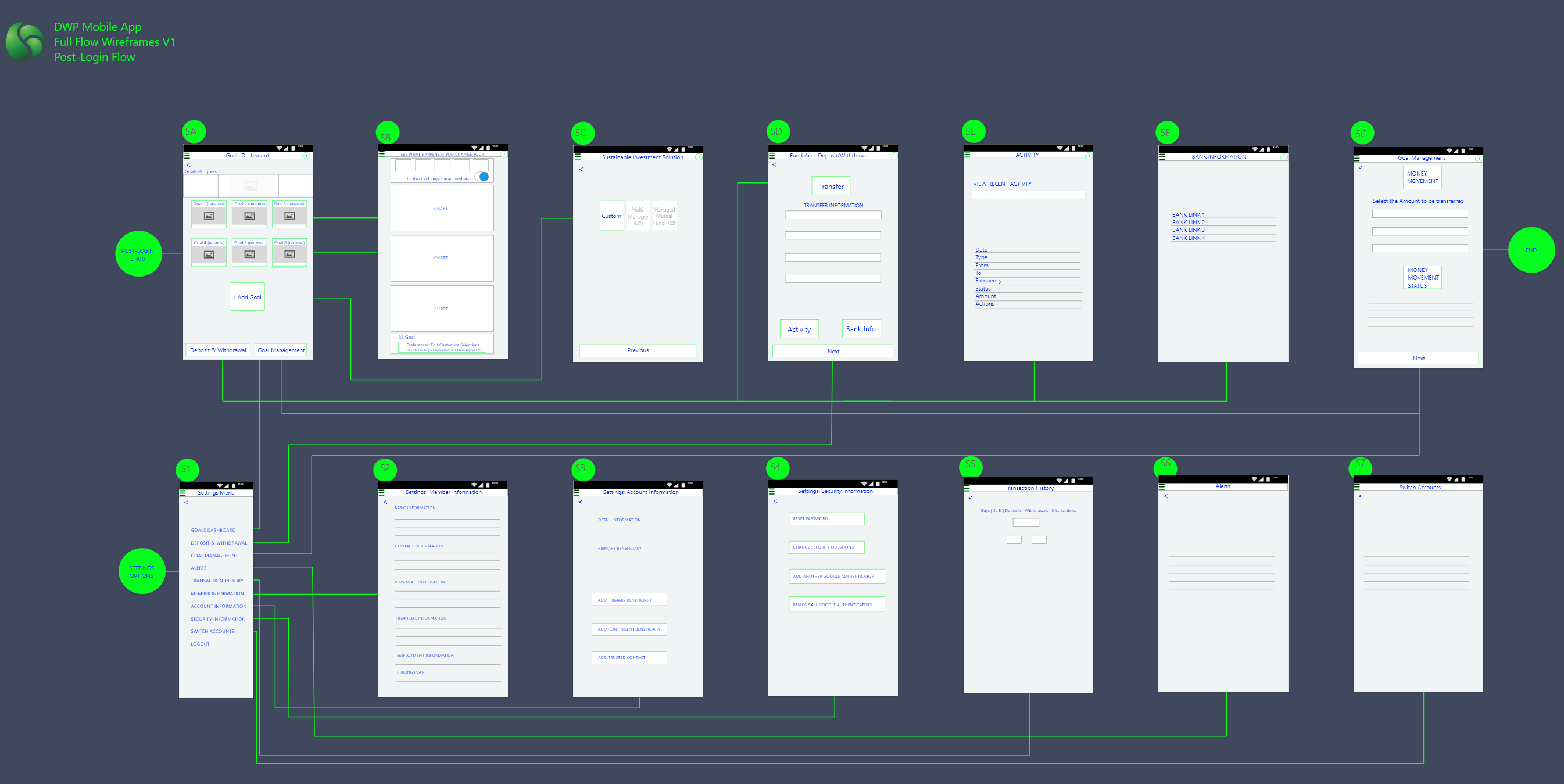
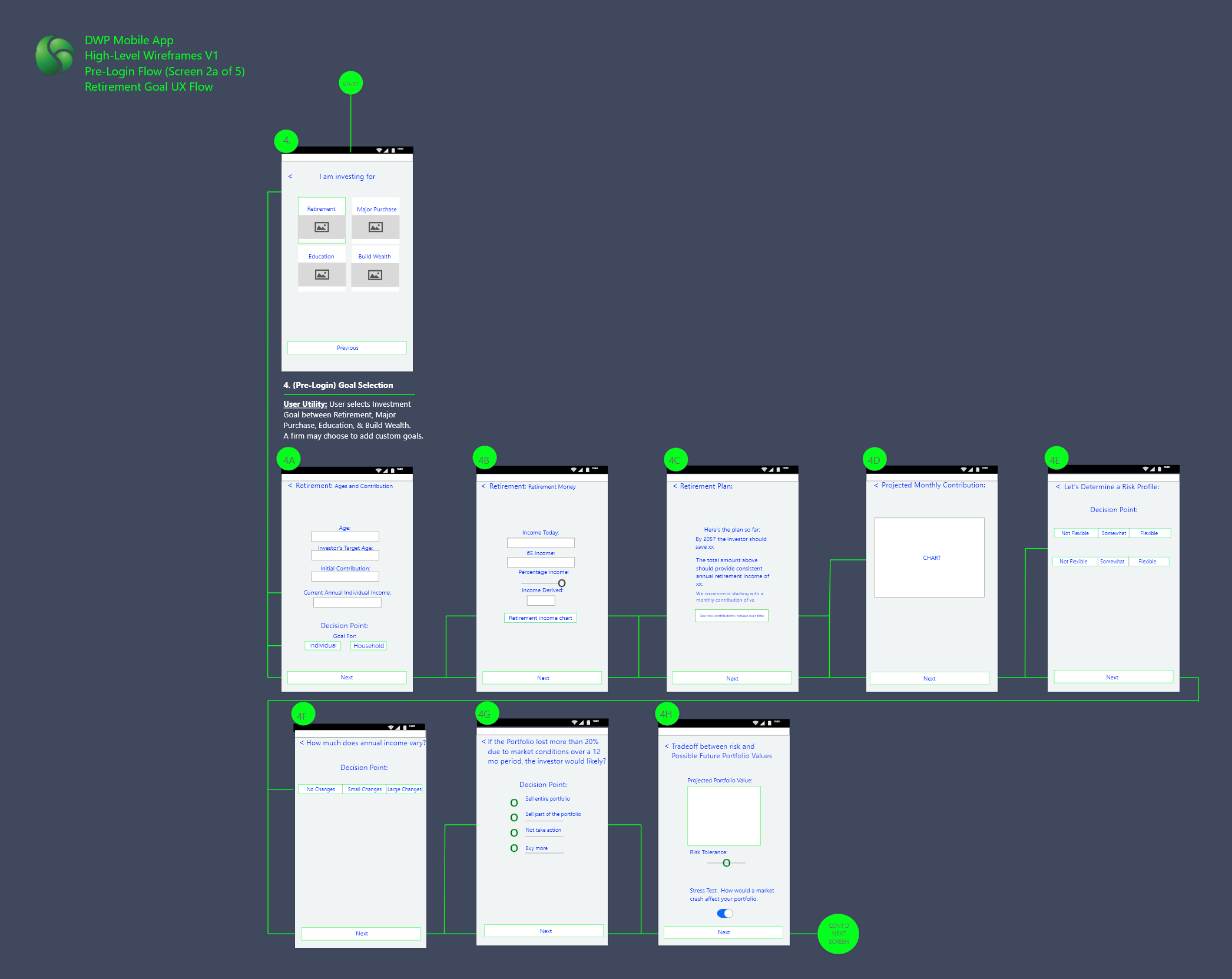
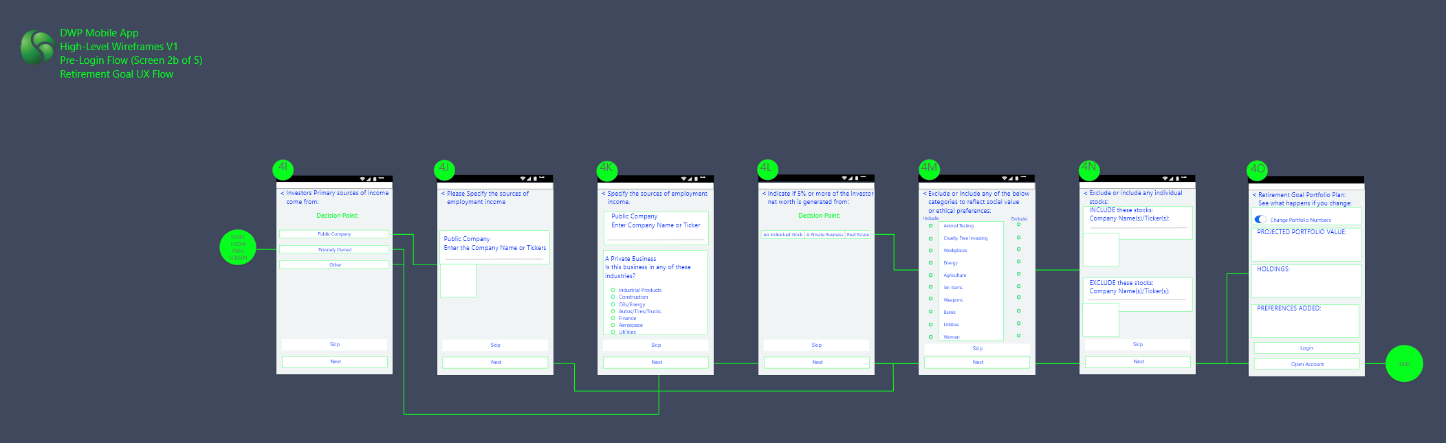
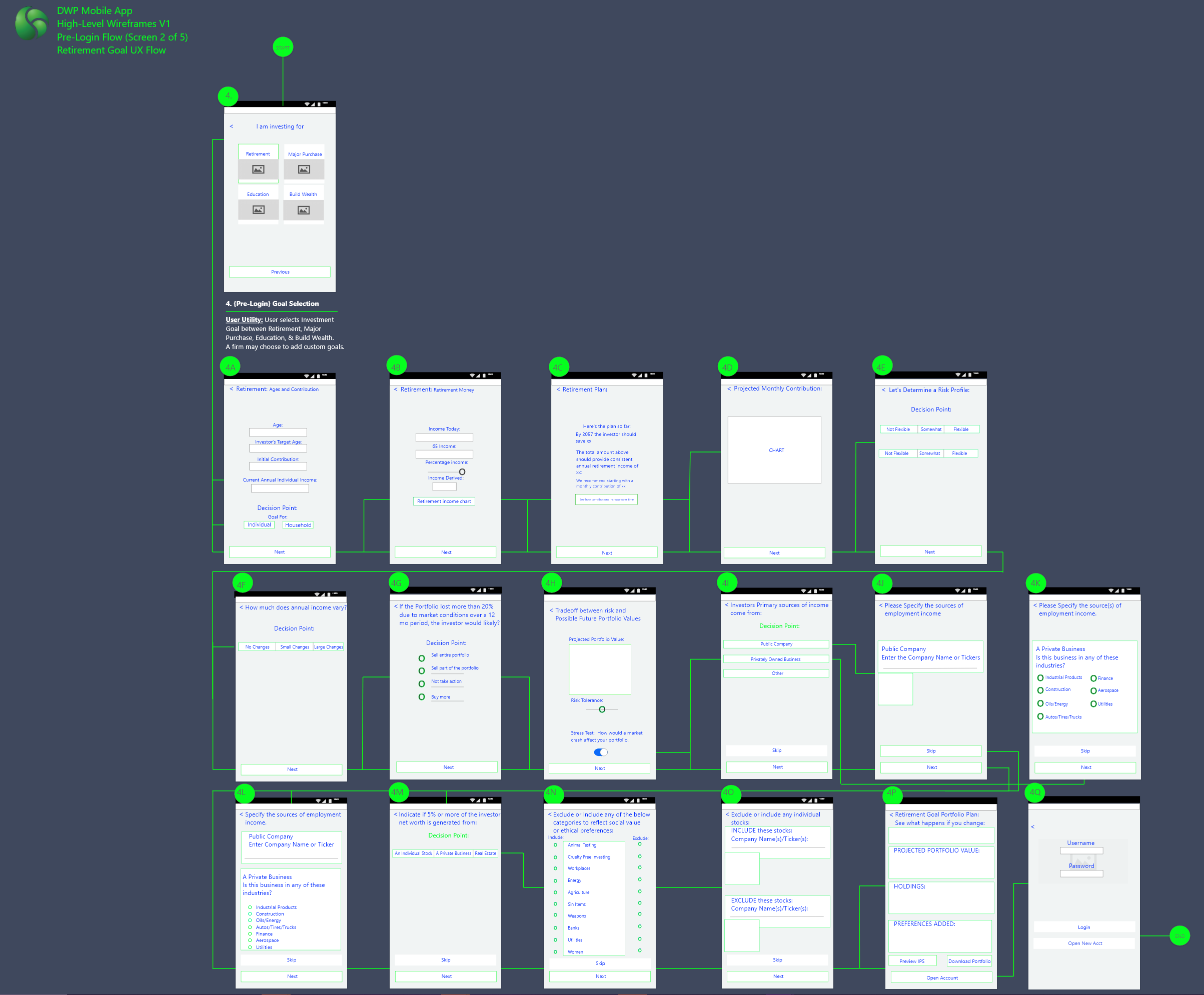
Wireframes
The first part of this stage I created low fidelity boxes and user flows to flesh out all of the features understand the content and functionality. Then once that was determined and validated against the requirements and users, next we created high fidelity content. This stage helps take into consideration the users needs.
Solving for the user:
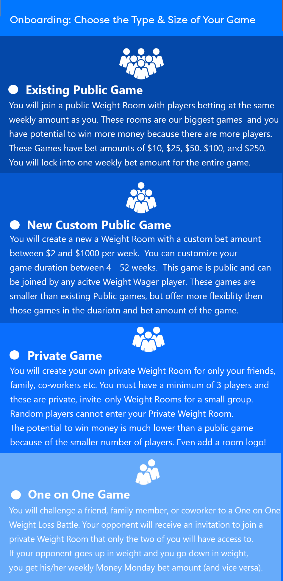
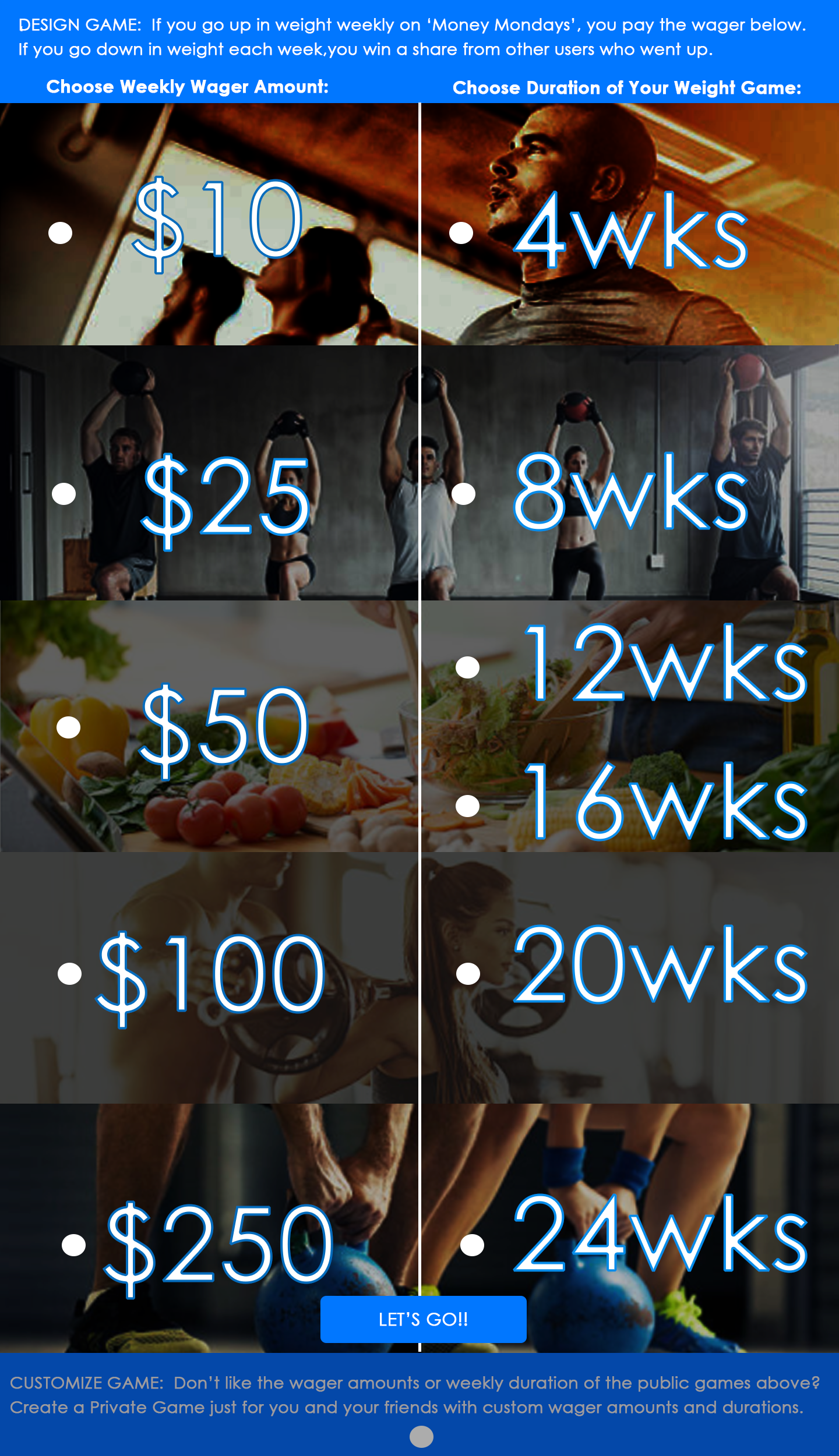
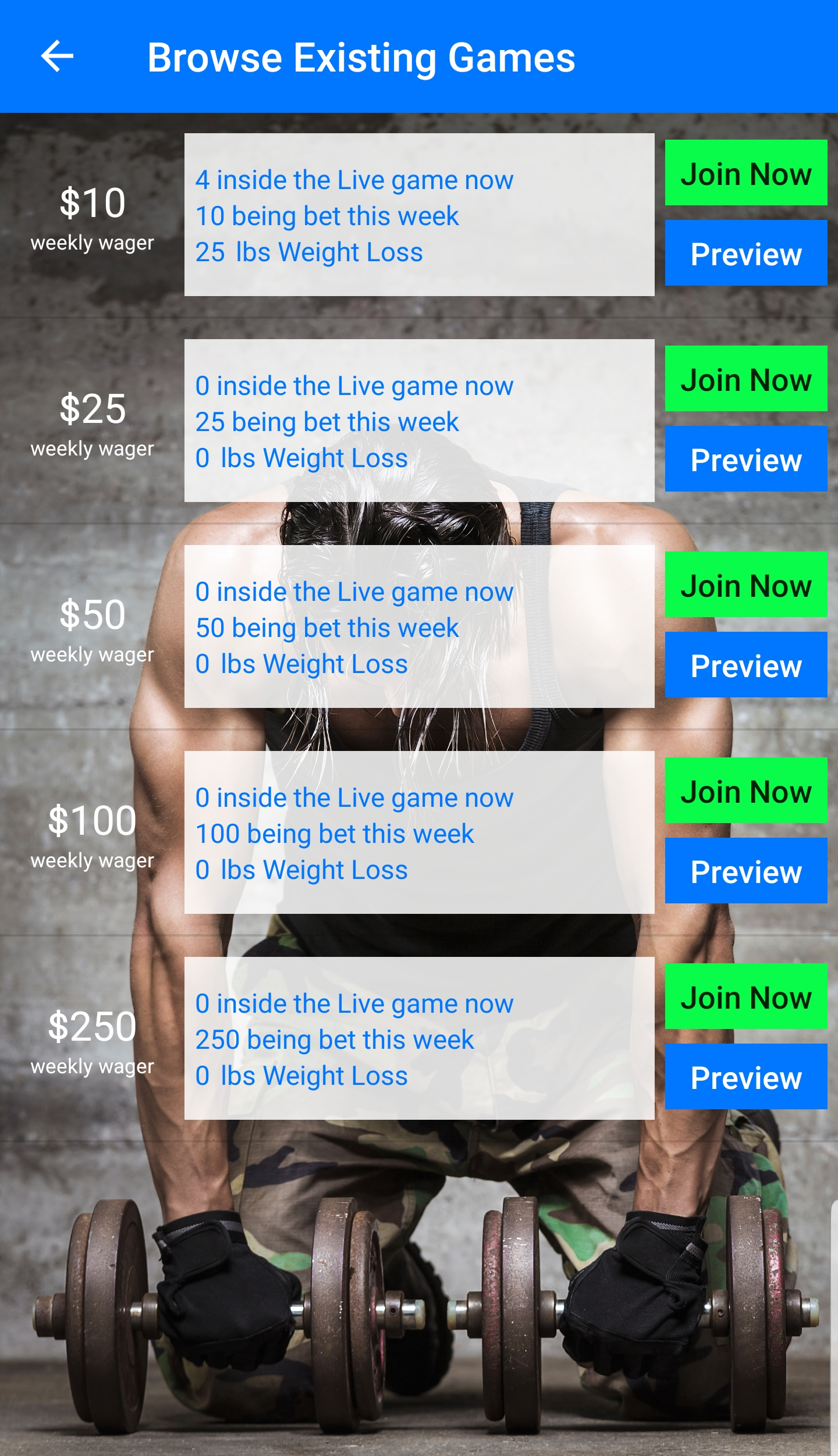
Problem/Pain Point #01 - Lots of Game Options: The users had an issue with being overwhelmed with too many different game options at one during onboarding. I call this the 'casino effect'. You get out on the game floor for the first time and where do you start? So many options. So based on this feedback I redesigned the onboarding game choice screen with 4 basic options based on the 4 main user personas that I found during the UX research stage.
Solution: Here is an example of that solution. After this was changed in the app, I no longer had basic questions on which game to choose, because all of that was defined in the user text of the onboarding screen and served the 4 personas and user needs/types.
Actual Weight Wager Mobile App Screens:
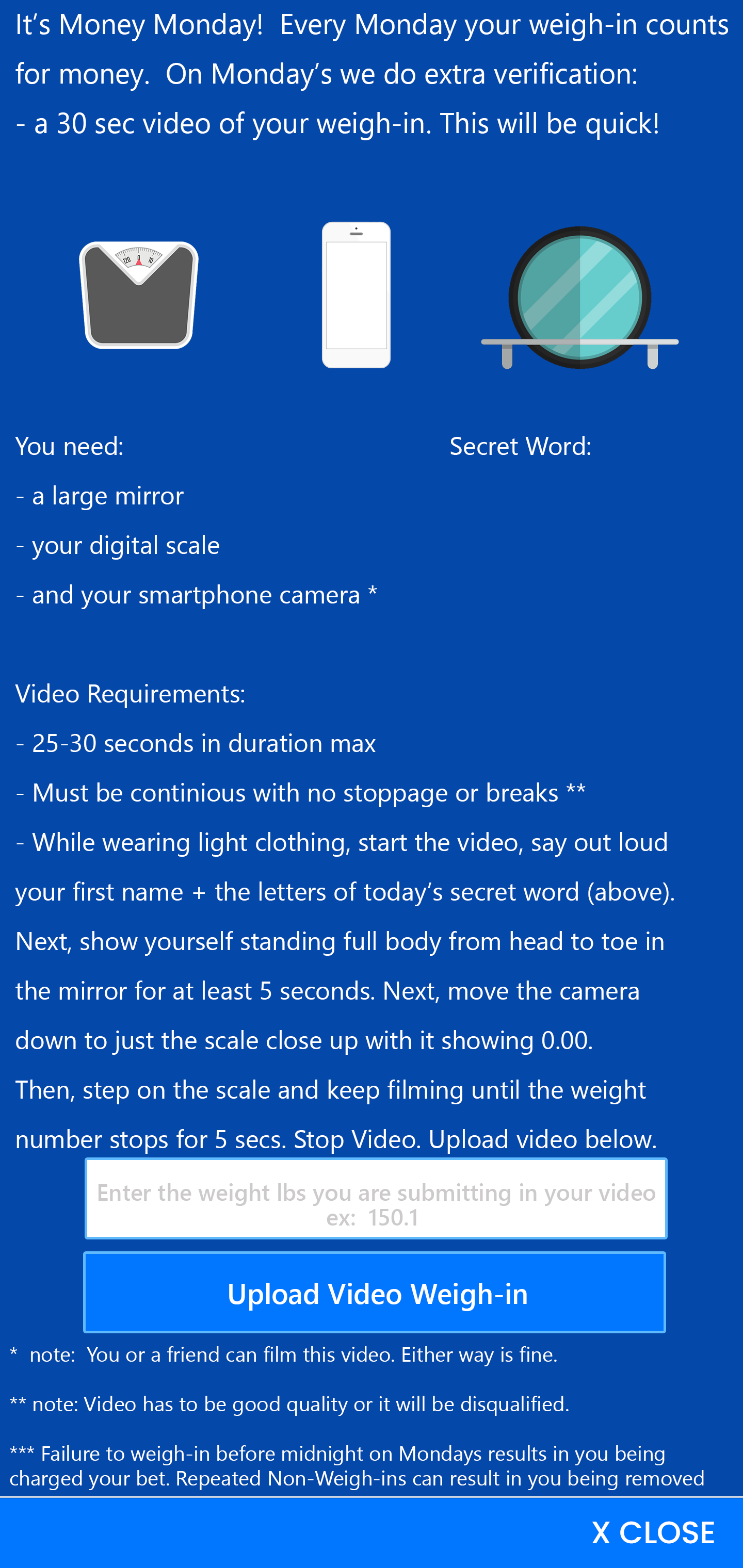
Problem / Pain Point #02 - Users had questions when it came to their first video weigh-in, in the app onboarding process. The users have to do a practice video weigh-in before on-boarding into the actual game and being live where it can charge their payment method. Because this is a revenue opportunity we really had to ensure that the user's were onboarding properly and were properly informed. So as more and more users onboarded and we saw what their questions, confusions and pain points where, we simplified the weigh-in AND offered them example weigh-in videos because we know that you can text instruct all day but some users have to see it - the are visual learners. And this is a 30 second process with different steps.
Solution: Here is an example of that solution. We gave them what they need to do in order and what they need to say in the video as well as an opportunity to watch a sample/example weigh-in so they are clear before they start recording and don't have to resubmit.
Problem / Pain Point #03 - Users were not always reading all of the rules of the game so after they onboarded they were asking questions on information that was already provided to them but they were skipping reading.
Solution: There is a rules screen in the onboarding section of screens that users must read and agree to upon onboarding. Like a Terms of Service that no one reads, it was lengthy. We simplified the rules, made them shorter in length first. Then we put them in the game menu so they can be referred to after they enter the game because I have found that users are sometimes in a hurry on signup - they are not fully invested yet in the product, but once they get into the 'meat of the app', the actual game and start playing week after week, suddenly they are engaged, invested and want to know more. Also I added more interactive and colorful UI indicators in the game UI so that the user knew what to do next at different parts of the game (and didn't have to refer to the rules) such as a weigh in button that changes from blue to red on the days you have to weigh in. Here is an example of that in the live game room. Pain point was solved because they don't have to look up the rule that you have to weigh-in on Monday's. The UI button turns a dramatic color to visually indicate that and it says that on the button itself on Mondays.


.png)
Design Challenge: Once for a UI UX job interview I was tasked with a design challenge: Re-design any public consumer website that you think could use an improvement. This is what I love. We could only work on it for 2 hours. If I had more time I would have made it better but this is what I came up with.
These wireframes resulted in High Fidelity UI Mockups which you can see some of those below: